
Final Thoughts
This experience of learning with my classmates and reading about what made an impact on them has been so satisfying. Seeing the world through another's eyes adds a whole new dimension to my learning. Lucky me to learn from such insightful and enthusiastic students.Thank you to eveyone for making this experience that much more meaningful.
As this class progressed I found myself making connections on a daily basis in what I have learned and what I see around me. I wouldn't have expected how much an education in art would impact me and bring the world alive in such a vibrant and meaningful way. Every day something clicks into place for me.To see a Mondrian print or a William Morris fabric or a book on the Bauhaus movement and now have some modicum of understanding of it's origins is wonderful.
I have always been interested in the lives of others. I am not surprised that I have often been more interested in the lives of the artists and their journeys to becoming artists or making their mark on the art world than the art itself. I have always been a voracious reader and viewer of documentary films and this quarter has provided so many new people to explore and I have supplemented my learning with books, films, lectures and museum visits. I heartily recommend the books I have noted in my field notes. If anyone would like to read any of these books and then discuss them, I would be very happy to do so. I can be reached at puppatina@gmail.com.
Art is an all encompassing vocation. It's a way of looking at the world and seeing what's beautiful, moving, inspiring or provocative and then using it in my own creative process. Art touches every facet of my life from the color of my walls to the beautiful meals I create to the photographs I take. Life is Art!
Everything I have learned this quarter has fed my creativity and provided more inspiration from which to draw. I hope you have learned something from my observations this quarter. Thank you Kent for another challenging and meaningful experience!
Module 1
It was very difficult to stop myself from reading too much as there were so many interesting subjects that I could still be curled up reading bits here and bits there. Illuminated Manuscripts! The Book of Kells! The Arts & Crafts Movement!
Of course I realize that any history book has a limited amount of space and cannot possibly show every example so my first observation based on the book’s examples was how quickly it appears that people were able to create order and beauty in the earliest forms of visual communication. Many of the alphabets are unequaled works of art visually and of course in purpose. I wonder about the affect of illiteracy on written language as it eclipsed pictographic language.
It quickly becomes clear the affect art has on our society when you consider how our visual culture so closely tracks. Fashion, architecture, interior design, graphic art and even music all seem to have the same destination in mind. The 60s being an easily visualized era for most of us, consider the clean lines and low slung silhouettes of the furniture and of Eichler homes, the simple geometric forms used in the art of Peter Max, the simple visual quality of Andy Warhol’s portraits. Even the early music of the Beatles calls to my mind simple chords, basic feelings expressed and long sunny days. Of course I realize that there is a whole other side to the 60s.
I have heard it said that you should keep your trendy clothes because they will be back in fashion but that isn’t entirely true. So much of what I see now looks to be intricate organic design ala William Morris layered over an earthy texture. The bell bottoms and baby doll tops I wore in high school are not quite the same as those worn today. They don’t have the edge that today’s fashions have. They were more relaxed and the color palette seems to me less contrived.
Those are examples of how eras are revisited but with a dose of modernity.
I am looking forward to delving into this book and this class as this subject covers so much more than graphic art. Everything is interconnected. What we learn about art history also teaches us about our culture; our politics, our beliefs and what we value and aspire to.
Module 2
Reading about man’s need and desire to communicate and the long rich history of visual communication is a real gift. If we were still out hunting and gathering, we wouldn’t have time for this studying thing.
Module 3
While reading this week's assigned chapters I was struck by the similarity of displaced worker then and now. With the advent of printing, scribes, once revered for their talent were displaced by the printing press. They tried to stage and revolt but were not supported by their local government. Some used their skill to teach writing to the newly literate.


http://en.wikipedia.org/wiki/Sarajevo_Haggadah
Module 4
There is so much that amazes and surprises me as I read the text.


Module 2
Reading about man’s need and desire to communicate and the long rich history of visual communication is a real gift. If we were still out hunting and gathering, we wouldn’t have time for this studying thing.
Trying to understand what it must have been like to feel the deep need to communicate takes me back to my oldest son’s early childhood. Aaron is ‘moderately-severely’ deaf. I remember how hard he would work to try to get his point across before he and I learned to sign when he as 18 months old. As the vast majority of people can’t sign Aaron has become a master of non verbal communication. You do not want to try and beat him in charades.
Aaron works in a grocery store and has to communicate with hearing people all day long and although it’s easy for him to communicate easy concepts (pictographs) and ideas (ideographs), trying to communicate deep feelings has caused Aaron real pain and profound frustration. It is a very painful thing for a parent to witness. When I think of man first finding himself with that need to communicate, I think it must have been like that. I imagine that frustration would have been an important driving force behind our resolve to learn to communicate.
From the vantage point of our evolutionary place, it is incomprehensible to think of our lives without language. It wouldn’t be possible. If there were no language, no communication, we wouldn’t be able to peaceably coexist. Most of the problems we have in our world today are caused by a lack of communication at a deep level and about some of the very same things that drove us to communicate in the first place such as spirituality, economics, ownership and ideals.
To me, one of the most surprising things about even the earliest forms of visual communication is the methodical and artistic nature given to even the earliest forms. It shows how man’s intelligence really evolved in the face of requirement and opportunity.
Module 3
While reading this week's assigned chapters I was struck by the similarity of displaced worker then and now. With the advent of printing, scribes, once revered for their talent were displaced by the printing press. They tried to stage and revolt but were not supported by their local government. Some used their skill to teach writing to the newly literate.
This made me think back on my early career as a drafter and illustrator. I had great skill and my drawings were used in engineering and marketing for a variety of uses. The advent of CAD drafting put an end to that career. Engineers began creating their own drawings and the role of even a CAD drafter is very limited. With any technological advance there are obsoleted positions and workers have to adapt as best they can.
Nowadays there isn't much that seems out of the realm of possibility for the human mind to accomplish but it certainly wasn't always that way.
Witchcraft seemed to be a common justification to many things that seemed unexplainable at first. Johann Fust was forced to explain Gutenberg's printing process to the French who upon seeing the number of bibles printed and their conformity raised the cry of witchcraft. That event sparked the writing of numerous books centered around the dissatisfaction with the limits of human knowledge. There have always been great thinkers and the printing press gave us the gift of their knowledge as it still does today.
I'm not surprised that censorship started with the church. Church in my opinion being synonymous with government and politics.
Those in charge, whether elected or appointed, always want to try to control their constituents in some way. The church must have been very fearful once they had to share literacy as it opened the door to free speech.
Reading about the advent of the printed word makes me want to share a book with you. One of my prized possessions is an 1893 book of photographs from the Columbian Exposition; otherwise known as the Chicago World's Fair. It is interesting to look at the publishing info after reading about the history of printing.

I love this statement from the bottom part of the title page,
"Authors of "Shepp's Photographs of the World, " the most famous book of modern times.

I take no credit for their grammar. :-)

The Alphabet Versus the Goddess
Thanks Kent, for recommending this book. It's an exceedingly informative and insightful book from the very beginning.
Firstly I am sad that such an original thinker has dies. By all accounts the author, Leonard Shlain, was an amazing scholar, brain surgeon, father and communicator. I would have loved to have had the opportunity to attend a lecture given by such a passionate person. This book is as instantly enthralling as a great novel. For someone without any formal education in evolution or the acquisition of language, the book provides a no nonsense explanation of how our brain evolved to our current incarnation. Mr. Shlain explains his hypothesis of the loss of the Goddess culture as a result of our acquisition and employment of written language over image based communication, resulting in a shift to the differently evolved left brain. From that point, we have never looked back. Mr. Shlain explains how men developed a more linear approach to thought processes and women a more broad approach to the world and to problem solving. Historically that has been the case. What about the current state of our social evolution now that we are acting "as if" we are all the same. Women can and should do what men do and men should be more like women. Are we forcing a change in our evolution much like the acquisition of language did? Is that how it happens? We know that other cultures don't have these same gender blurring so who wins out?
In the book, "The End of History and the Last Man", the author, Francis Fukuyama, among many other theories, posits that the spread of Western Capitalist culture would end the need for physical war and as such the need for the ultra manliness needed for a warrior. It's an interesting theory. I can't help but wonder what would happen should Muslim Fundamentalism or for that matter Christian Fundamentalism be the overriding force.
Consider the proliferation of psychiatric drugs given to women who are too emotional or the stimulants given to boys to counteract their more male tendencies. Is this another step toward creating one sex? I see so much posturing and competition between some of my married / committed friends relationships. I believe it is because of the blurring of genders. I find it painful to watch. It does seem different in the next generation. My younger friends don't seem to mind who makes the most money and since they pick up the kid(s) at daycare and dinner on the way home and have a housekeeper in once a week there isn't the same conflict.
There is a lot to think about and I find it fascinating.
People of the Book by Geraldine Brooks
Another fascinating book that I'm reading is also apropos is the fictional story of a book conservator and her journey to uncover secrets of a real historic Hebrew text called the Sarajevo Haggadah. The codex that inspired this book is believed to have been created during Spain's golden age in the mid 14th century but that is conjecture as there is no colophon.

The Sarajevo Haggadah is a Jewish religious text illuminated that sets out the order of the Passover Seder. The fictional conservator uses clues found in her rebinding of the ancient book such as an insect wing, a hair and wine stains to try and determine the past history of the book. It's a fascinating read and I recommend it highly.
Module 4
There is so much that amazes and surprises me as I read the text.
-William Leavenworth actually had customers send a drawing of one letter and he would create an entire font based on it. In 1834! Wow!
-In one year shortly after daguerreotypes were somewhat perfected, though with limitations, one being the long processing required to print, 5000,000 were made in Paris!
-Louis Prang seemed to me to be a marketing genius! He created markets for products that hadn't even existed before. He was really ahead of his time. He used the new chromolithography to it's absolute fullest to make his ideas reality. His imprint is still a huge part of our culture in the form of greeting cards. Art supplies and self taught art education materials were also his ideas along with some of the very first art journals. He would have fit right in with the entrepreneurship spirit that exists today. He may have given Larry Ellison a run for his money. What a fascinating person.
-John Bufford was another innovative thinker and designer. His drawing talent, use of color and his original thinking beget beautifully realized tonal illustrations.On top of his considerable illustration skills he was one of the first to really consider the complete set of design aesthetics required to create a fully realized vision. The poster he created for the Swedish Song Quartet with the caps over the heads of the soloists reminds me of the Amazon logo:

-William Morris really created a life based on his philosophy and was able to surround himself with what he considered beautiful. I watched a documentary about Valentino the haute couturier and it made me think of Morris. Valentino had the means to create a life of beauty for himself, beauty that he created and very much controlled in every facet of his life. Not many are so lucky to have the ability to control their world to such a degree. Morris had a hand in so many different design concerns that he really did visually control his every day life.
These people left us a considerable legacy of design philosophy, innovation and craftsmanship that is truly awe inspiring.
The part that illustration played in the early days of advertising prompted me to look at an old September 1925 issue of National Geographic for examples. I was surprised at the number of ads that used both photography and illustrations such as this example for Whitman's Chocolates. Click to view a larger version and read the copy as it is really something!

This example shows the use of hand lettering along with photography. It seems a quaint mix of what was then old and new:

Can you believe that in the last years of the 1800's popular magazines carried 1oo pages of advertising in a single issue?? That may actually be worse than today.
The schism between typographers philosophy was born as early as the Victorian era as purists complained about attention getting visuals as opposed to idea that type should "serve the text first and otherwise stay in the background".
Jessica Hische is an illustrator whose work I admire. She tries to create a new drop cap every day. She's mostly successful at meeting that challenge. I think creating an artwork every day is a wonderful way to keep your personal creativity flowing:
Jessica's blog:
http://www.jessicahische.blogspot.com/
Module 5
Art and politics have always been the closest and strangest, of bedfellows.


Module 6


Module 7


Module 8


Module 10Art and politics have always been the closest and strangest, of bedfellows.
Artists as activists have been very successful in spreading dissent. Their work is sometimes obvious but oftentimes it is more furtive and requires the viewer/reader/listener to delve deeply to puzzle out the meaning. Once that happens, word travels fast.
The thought of the amazing artist Kitagawa Utamaro being so heart broken after his incarceration and torture that he lost his devotion to his art is the down side of an artist using his gift in the service of his beliefs. Naming names of some of his subjects was a political statement he must have felt he had to make and it cost him everything.

It isn't just a historic occurrence. Robert Mapplethorpe's photographs continued to cause an uproar as recently as 1998 when police in Britain confiscated a book of his photographs and threatened it with burning . Luckily, in the end that wasn't the case but just the idea that things like this can still happen is almost inconceivable. Mapplethorpe's photographs came about after the Stonewall riots of 1969 New York when gay men were actively fighting to be recognized as people with rights. Mapplethorpe's work put that struggle in the forefront with his erotic gay images and the news they garnered.
An aside: An excellent documentary of Mapplethorpe and his lover, the art dealer and amazing character Sam Wagstaff is Black White + Gray. http://www.blackwhitegray.com/ Fascinating!
This is a really well done site.
There is a page that highlights an exhibit called The Design of Dissent at New York's School of Visual Arts. The first link doesn't work. Use the second. Here are some images that really spoke to me:

There are so many works of art that have been in my life peripherally without me actually being conscious of them. Two Japanese woodblock prints have been displayed in my cousin's house all of my life. They are Katsushika Holusai's 'Red Fuji' and 'In the Hollow of the Wave off the Coast of Kanagwa". I never thought about who created them. It's interesting to learn of the profound affect that national isolationism had on art history. It's hard to imagine what Japanese art of that era would have become had the country been open to input from all over the world. I love it the way it is. The simplicity of some images of nature especially, is breathtaking.

My guess is that Gustav Klimt's masterpiece "The Kiss" is one of the most imitated artworks of all time. I have known teenage girls who have loved this work so much. It captures romantic dreams so completely. These are some examples of his work interpreted by artists on the web:

A hero of mine is Julia Morgan (1872-1957) an amazing architect and a woman waaaay ahead of her time. She was a student of the Arts and Crafts movement and was very much influenced by Frank Lloyd Wright's mathematical approach to the visual in architecture. She is best known as the architect who created Hearst Castle for William Randolph Hearst. Her own designs more typify her love for both Arts and Crafts and California Mission styles of design. She was an amazingly gifted person who followed a very tough road to get to her place in history.

In closing, I'd like to tell you about a strange coincidence. I was reading the Alphabet and the Goddess - la,la,la,la - and when I grabbed my bookmark, something about it looked familiar. I don't know where it came from and I don't remember seeing it before but below you will see a photo of it. It has on it an illustration by Alphonse Mucha.

Here's an on-line gallery of the Mucha Museum
Module 6
Every week has so many things that are interesting and add more pieces to the puzzle of how we got here both in terms of art, and as people. I find the study of art to be like the study of the Bay Area. They are both huge multi-cultural stews made up of the best (mostly) of every culture.
Cubism. I found that Leger's * The City did a great job of illustrating Cubism and how human vision plays such a role. *"Our eyes shift and scan a subject; our minds combine these fragments into a whole." The fragments of expected urban sights absolutely do add up to a complete picture in my mind.

Some of the Futurist's work is so modern and fits right in today. Maybe because it is now the future. ;-) I love the work of Ardengo Soffici in particular. * Bitszf + 18...... is so dynamic and exciting.

The fact that futurists considered typography to be a *"concrete and expressive visual form..." reminded me of an idea I had around the problems that occur with email. Email is so often taken wrong. Everyone I know has misunderstood or been misunderstood via email to include etudes. I think that all word processing programs should have some font choices that would universally be accepted as: sarcastic, loving, humorous, obsequious etc. That would solve so many problems and could be my retroactive contribution to the futurist movement.
Lucian Bernhard was the rare person in all of these writings. Most artists worked with another when they came up with a new direction for art. That makes sense as it is the discourse between us that sparks excitement, discussion and new ideas and hence the beginning of any movement. Lucien was a young boy with only an eye for what was really of consequence in (advertising) design. His works are so clean and modern. His use of negative space adds to his spare style and it works so well even today.

Some people are born with an innate talent and it's really a miracle when one finds what it is and makes it their avocation.
John Heartfield certainly chose a fitting name for himself. I am sad to say that an exhibit of his posters would still be "Unfortunately Still Timely". I hope that changes in my lifetime. It does show what an impact artists can make in the world raising consciousness and awareness for their causes. Or just making us stop for a minute and reflect. There has actually been a musical written based on his life. It was done in 2000 at Towson University near Baltimore. The photos of the participants seem so happy and weirdly at odds with this most serious man of whom we have been reading. This example of his work, Hurrah! The Butter is all Gone, is very arresting. Look at the detail all the way down to the swastikas embedded in the wall treatment.

Translation I was able to find:
"Hurrah, the butter is everything! Ore always " a realm strongly made; Butter and schmalz at the one most people made fat" via babelfish.yahoo.com. This example is a classic case of what we as designers are taught about getting to the essence of the statement we want to make and working from there. What could be at the soul of the statement Heartfield was making than this:

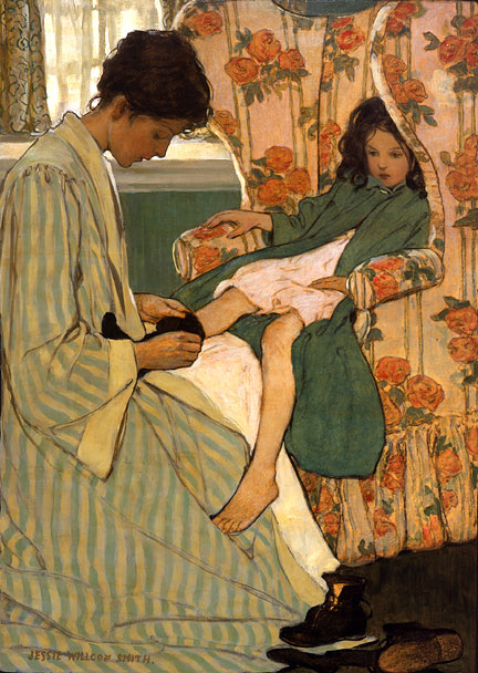
At the back of all of the developments in art and society is the beginning stirrings of women's rights.What stands out for me as always are the stories of women who were passionate enough to buck expected traditional roles to create the lives they wanted for themselves. That said, the story of Jesse Wilcox Smith, Violet Oakley and Elizabeth Shippen Green leapt off the page and sent me into research mode.

This is a work by Wilcox Smith:

An example of Shippen Green's work:


Oakley, Shippen Green and Wilcox Smith were three of the most important illustrators of their time.
It was fortuitous that they found each other. The support they provided one another was undoubtedly considerable.
They spent almost 15 years together sharing a house, work, friendship and at least one love affair. They lived together with a woman called Henrietta Cozens, in the role of house manager of sorts, in a house called the Red Rose Inn and became known as the Red Rose Girls. There is a biography of that name written by a San Jose State Illustration professor named Alice A. Carter.
Side Note: Astonishingly (to me anyway) the book is not available in any of the area libraries including MLK library in San Jose which is the library for SJ State. I ordered the book but it is not due to arrive for 2-3 weeks. If it comes while still class is still in session, I'll report back.
UPDATE: I received the following message back from Ms. Carter this morning, Tuesday:
Dear Robin,
Thanks for your interest in "The Red Rose Girls." The book is available on Amazon or at the MLK library in special collections. Since you are interested in female artists, you might like to go to the following site and read about how the book is being adapted for a Broadway musical.
Best Regards,
Alice Carter
Alice Carter
The women met in 1897 in an illustration class taught by the very famous illustrator Howard Pyle.
Jesse didn't begin drawing until she was 20 whereas Elizabeth was the daughter of an illustrator. Violet Oakley began as an illustrator but is most remembered as one of the greatest American muralists. The Violet Oakley site is gorgeous and I highly recommend you visit especially if you have an interest in web design. Her site contains more biographical information than is found for the other two. Violet studied at the Acadamie Montparnasse in Paris before settling in Pennsylvania. At the age of twenty-four, she was commissioned to create both a stained glass window and mural for The Church of All Angels in NYC. The resulting art works are considered her most lauded work and made her North America's first professional female artist. I could find no usable images that did that did mural justice although the web site cited above is close.
I have a special place in my heart for photography as it is my hobby/passion.
Man Ray was an interesting artist with many modes of creation. He is best known for his surrealist photography:

He was quite the womanizer and a closet sexist wearing his feminism on his chest more because it was expected than anything else. He met his match in 1929 in the guise of a high-spirited American woman called **Lee Miller. Lee was the subject of a research paper I wrote which I would happy to share with anyone who might want to read it. Teaser: Once WWII consumed Europe, Lee became a war photographer in for Vogue magazine in London and was taking a bath in Hitler's bathtub as he was dying. She was a really interesting woman in the art world. Many of Man's photographs feature Lee, or parts of Lee. Together they accidentally (re)invented the "solarization" technique featured in this photograph and many others:

It is lifted from a great surrealism and design page I found created by John Coulthart's.
Solarization seemed to have been rediscovered over a period of years. There is evidence that Degas used a solarized negative to create his famous ballerina paintings. The movement is so clear in the negative.


The surrealism movement is another example of the small number of artists that share a vision and together change the world of art.

Cocteau
A surrealist film maker called Jean Cocteau gave Lee her only acting job in one of his (very) strange films, The Blood of a Poet.
A few of Lee's more well known surrealist photographs from her website:

The Shadow of the Great Pyramid

Portrait of Space

Exploding Hand
Surrealism gave art humor and excitement and the element of surprise to art. What a gift!
* From our textbook
Module 7
Firstly, I can’t help but think of the parallels between the era in which the WPA was created and our present day circumstances. I’m not the only one of course.

*The Arts programs put in place starting in 1935 beget the only time in American history when art became a national focus. Coupled with the influx of immigrants from all over the world, the art was bound to be rich and varied. America was and is still a very young country without the benefit of the years of artistic exploration that Europe had. We didn’t face the personal threats of Fascism and Nazi extremism that pushed people and their art to new boundaries. Some art absolutely comes from a place of creating beauty whereas much of the important work comes from trying to understand and make sense of what is happening in our world; both the physical world and the universe that lives in our minds.
The Bauhaus School was about creating an ideal spiritual society and in some sense, the experiment came to America at the right moment in history. Emigrating from countries under siege by their governments to a place where artists were encouraged and even PAID to create must have been like heaven. The influence of the Bauhaus school is so much a part of our modern landscape and is the foundation on which so much design is built. The maxim "form follows function" brings to my mind the quote about typography being invisible to the message. Coming from a technical background, I am enamored of much of the work that comes from the Bauhaus School movement. I am drawn to the idea of every line and every color being part of the overall work without elements. This work of Mohoy Nagy's reminds me of a next gen Mondrian:

Today there are WPA-like programs are being put in place to get some people back to work but other than rare instances like the Bridgeport project above, art and artists are not a much of a priority in today's society. Arts programs have been drastically cut in public schools. As a product of parents who were musicians and supported us with their art and someone with artistic aspirations of my own, it's quite insulting to have the arts treated as inconsequential by our government. As much as I would hope things would change under our current administration, sadly there are other urgent matters that require their attention.
It's wonderful that so much of the art created under the art program is available to view on line. I wasn't around in this era but even when I was an illustrator in the 80s, we created our work in much the same way as a poster like this with hand lettered text and drawings:

The WPA Mural Project is said to have been inspired by Diego Rivera and the Mexican Muralist Movement.
Diego Rivera created the Pan American Unity Mural at SF City College. The website for the mural Rivera Mural is really well done and contains a lot of information including letters, photos and memorabilia including these:


I found this slide show of a great series of WPA posters created for public libraries.

I wanted to see if there were any WPA artworks in my area. I searched on this site: http://www.wpamurals.com/ There is an art glass piece that I have actually seen by Edgar Dorsey Taylor. It is located at Herbert Hoover Jr. High School.

There were of course many other artworks created for the New Deal program including film, theater and music. You can spend (and I did) hours on line looking and listening to the fruits of WPA labors.
* Some of the info in this paragraph came from my essay question on the test but I wanted to explore it more fully.
As an aside of which I seem to have at least one every week, some of the members of one of my favorite bands, the now defunct Nickel Creek, have joined with other really great musicians to create an expandable collective band called, you guessed it, Works Progress Administration.

Give them a listen!
Module 8
I was lucky enough to attend a talk Matthew Carter gave at San Jose State this last week. And since he is the only famous typographer I have ever met, I’m going to tell you about it. Firstly he is a very entertaining and witty speaker. His talk reminded me of the movie Helvetica in that you don't have to be a designer or design student to be enthralled by the movie or by Mr. Carter. He said that it used to be that when someone on a plane asked what he did and he said he was a type designer he would get a blank stare but these days any 8 year old can have an intelligent discussion with him about fonts. That says so much about the democratization of type. Matthew Carter is inspirational to me. He is 72 years old and he is still teaching, learning and creating on the leading edge of new technology. He was one of the last people to learn the craft of punch cutting type and now is known to most people as the creator of fonts for Microsoft such as Verdana and Georgia. That is quite a technological career span! When asked how he feels about the multitude of fonts created by the talented and the perhaps not so talented, he said, “The results are not always wonderful, but you cannot champion the demystification of something and then protest that the result are mystifying!”

There was high drama in the world of typography when Ikea recently redesigned their catalog replacing longtime font combo of Futura and Century Schoolbook with Verdana and some typophiles are not happy! Ikea wanted the same typographic identity world-wide for both web and print. Matthew said that he was actually impressed with the work the designers put into the kerning of a web based font and that it looks good. He has wonderfully divested himself of opinions for work he has done for clients. It’s theirs now.
This evening I am watching a Ken Burns/PBS biography of Frank Lloyd Wright. I had no idea what his personal life and tragedies had been. Gripping. I highly recommend it. It's on Netflix instant watch list. The film talks about how FLW was looked upon as passe and old fashioned by the time the new moderns came to America with their love of technology and sleekness and steel. He felt their designs were without soul. It was said that when a fly landed on his drafting table, he would name them Gropius or Meis and then swat them dead. He wasn't really known as a magnanimous and kind person.
I have seen pictures of beautiful houses before but Falling Water, the house FLW's built at Bear Run in Pennsylvania actually brought tears to my eyes. This is sanctuary in the highest form.

Falling Water was created in part as an answer to the new moderns who called him passe even as they emulated his deigns in many ways. He wanted to create a home using his own design ideas but make it look as modern as anything the younger set was designing while still maintaining, and in my opinion creating, the true meaning of soul.
The chapter on corporate identity of course hits close to home for those of us inundated by it above and beyond what the rest of the country sees every time we go 2 blocks. We are surrounded by examples of what works and what doesn't. (Click for a larger view)

The IBM logo has stood the test of time and is immediately recognizable. Because of the proximity of lots of these companies I'm not sure if they really are indelible examples or if I just see them so much that they become so for me. So many things in life we just take for granted without thinking about who had the idea in the first place. One of those is the corporate identity manual which I'm sure many of us were tied to at some point in our careers. It's an absolutely essential tool for creating consistency in a company's identity and covers so very much. William Golden at CBS and Georg Olden (another great story) were pioneers and had to lead their teams to be innovative to create effective and engaging visuals for television, a whole new medium. Learning to create designs from the center out to quickly implant a graphic message, to use simple signs and imagery for the most impact and recognition. The Big Push (pg 400 image 20-5) is an amazing example of getting to the root of what you want to say and then saying it with elegance no matter the message.
It must have been such a rich and fertile place to be when you were lucky enough to have management in your corner understanding the possibilities of what could be accomplished. Every movement, every school of design, every new medium and creative genius all connects and now we are at the forefront of everything Muriel Cooper dreamed would be possible for new media. It's another exciting time for designers.
It's no secret that I am especially interested in the subject of woman in design. I think it's just incomprehensible that the talents, the ideas, the humanity of so many people were shut out for so long based on gender, color or whatever! Bea Feitler was an amazingly talented designer and art director. By all accounts she was an exuberant and charming person with an infinite capacity for learning and being challenged by life and by her work. Her Latin heritage shines through in her use of color and form in new ways that hadn't been seen before. She helped to change the direction of magazine graphics. She died young but left us so much.


A really great article on Bea Feitler written by one of our textbook authors Philip Megg can be found here:
http://www.aiga.org/content.cfm/medalist-beafeitler
Bibliography:
http://www.nytimes.com/2009/09/05/arts/design/05ikea.html
New Yorker article, Man of Letters, December 2005
http://www.newyorker.com/archive/2005/12/05/051205fa_fact_wilkinson
Design Museum article
http://designmuseum.org/design/matthew-carter
AIGA article
http://www.aiga.org/content.cfm/medalist-matthewcarter
Module 9
Peter Max was a huge part of my life. I wanted to be a sign painter until Peter entered my life. At that point my career aspiration was to become a commercial artist.As a young person I was drawn to his bright colors and unusual proportions and composition of his creations.

The psychedelia of the time did not speak to me. I wasn't a part of the 60s free love and drugs and rock n' roll movement. The art that went a long with that always seemed a bit foreboding to me. I was just too young. Peter Max' art was the perfect antidote in my mind. His posters covered my walls and my iterative versions filled my notebooks and bulletin boards.
His work has evolved to more of a fine art technique. He often uses the He doesn't only use the illustrative techniques of the 60s with this black outlines and flat color planes. Though his color pallet is still vibrant now he employs collage, painting and a more free flowing style.


In the 90s I had the chance to meet him at a gallery opening of his exhibit. He made it very clear that if I didn't have many thousands of dollars with which to prove my fandom, it didn't much count as far as he was concerned. :-(
The philosophy behind Push Pin is inspiring. To freely employ the techniques and knowledge of those who have created before is wonderfully refreshing and allows for continuous development and learning as an artist.
There is such a wealth of information about Seymour Chwast and Milton Glaser and more Milton Glaser allowing us to learn from them and continue with the Push Pin philosophy as we move forward in our learning.
Even at 80 Mr Glaser is still creating vibrant and groundbreaking work in his design studio, Milton Glaser, Inc. in his hometown of New York.

I love this photograph from his web page. It's beautiful. I like to picture him sitting there as I type this.

His work spans many disciplines a very few of which you can see here. Not only was Glaser inspired by the psychedelic movement of the 60s while it was happening, he still calls upon this knowledge now as seen in this calendar:

It is obvious by these works that Mr. Glaser is a keen observer of the world around him, not only the visual world but also of the humanity. This portrait of Louis Armstrong captures a vulnerability not usually seen in the great musician. It is the product of a skilled portrait artist.

His collotype image of a landscape is finely detailed and the colors are muted yet vibrant much like what you would expect to see on a golden fall day:

His kinetic sculpture for SVA Theatre in NY was unveiled in July of this year. The sculpture's form was inspired by Tatlin's Homage to the Third Republic.

The piece rotates in two directions every hour on the hour. At the same time, the announcement of the time appears on the marquee with an accompanying statement about the nature of time, such as this quote from Albert Einstein: "The only reason for time is so that everything doesn't happen at once." To see it in motion, visit here. Mr. Glaser is obviously a person living fully, still creating, learning and contributing his breadth of knowledge to the world.
His longtime partner, Seymour Chwast has also run the gamut of techniques and clients.

His iconic identity designs for the Brooklyn Children's Museum, the Children's AIDS Network along with his children's book illustration show a playfulness and brilliance that speak to children and to adults. His letterforms are fun but totally readable. They draw you in and make you curious about the subjects they stand in for.

At the opposite end of the spectrum in terms of audience and by all means color pallet is this ad Chwast created for the Economist. It's a real gem in the statement and the way it's portrayed. Its full of truth and humor. That's a grand combination in the ad world.

Like many artists, Chwast also creates art for socially conscience projects, but with his own unique twist. The below poster, while making a serious statement is still seems imbued with his hand drawn demeanor which adds to the vulnerability and insecurity of man in the face of such a terrible event like war.

His woodcut of crows is a dynamic composition with great tension and character shown. The blue is exactly the color of the sky on a summer's day. Gorgeous!:

Type design is also something for which Seymour is known—and for good reason.
Here is just a sampling of his designs:

Seymour's interest in publishing shows itself in his semi-regular publication of 'The Nose'. It is designed to bring attention to social issues that Seymour considers really imperative for people to pay attention to. Here is a cover that uses photography and it surely makes a point in a typically Seymour way; using humor, intention and dynamic placement of images to type:

I have covered in just a fraction of the work of 2 people, an extensive array of techniques. Every technique we master makes us more valuable in the world of design. That these two men are still creating, still in the office on Tuesday morning of Thanksgiving week answering emails from yahoos like myself really shows the difference between working just a job and having a career that inspires you and allows you to think outside the box (Sorry. I hate that term but it's so fitting some times) and challenges you on a daily basis. It will help you to stay sharp, focused and enjoying your days. You can't ask for much more in a job.
There is another book that has just been published that is very applicable to our studies. It's called, The Lacuna and it was written by a gifted storyteller called Barbara Kingsolver.I have waited 9 years for a new book by Ms. Kingsolver and that it is this particular book is just another example of the serendipitous nature of life. It is the story of an artist and his journey of self discovery while living in the household of Diego Rivera, Frida Kahlo and Leon Trotsky. I have just started it and it is fascinating reading already. Based on Ms. Kingsolver's past novels, the years and years of researching her subject provide her with an almost biographical basis for her characters. I recommend all of her books.
Happy Thanksgiving!
I am so thankful for the opportunity to share this class with all of my classmates. I have learned so much from everyone. This class has really opened my eyes to the interconnectedness of art with everyday life. I see examples everywhere I look. I guess this is just what education is. I'm sorry I didn't have/create this opportunity earlier in my life. It adds such a level of being present and of "seeing" to my life. I look forward to the next step in my art history education.
As new graphic design students taking fundamental courses in typography and design, its interesting to also be studying all of the ways to break the rules. We are learning to apply them, the old adage about learning the rules before you try to break them comes to mind. It keep things interesting. It reminds us that we can experiment and try new ways of seeing the world and then creating art that reflects that. Wolfgang Weigert did that. His values were artistic freedom and exploration and then like it or not, he started a revolution in graphic design.
One of the things I really admire about New Wave Typography is the ability to use words, letters, as design elements in and of themselves. I was really captured by the work of the young Chinese graphic artist Jianping He as he is a master of this ability.

His fusion of photography with dynamic typography first drew me in via the work that appeared in our textbook. Below are some examples of his work.

I am inspired by his integration of leading-edge, innovative placement with his Asian sensibilities. His compositions are edgy and very current while still suffused serenity and ease. Even when he uses color it does not complicate the composition or make it fussy. It retains its powerful simplicity. It's design negative space.

Even when he uses a purely typographic solution, the result appears both hard and soft; yin and yang as seen in his design for 2005's Best 100 Posters of China:

A detail of the top right type:

His web page (linked above at his name) shows humor and his love of typography:

This is the same page translated with a sweep of the mouse:

A closer look allows us a glimpse of the sense of humor involved in each word:

Even when showing (and celebrating) his Germanic educational roots, his own artistic direction is still conspicuous:

The China Image silkscreen Jianping created for the Taiwanese Poster Design Competition in 2004 uses a photo montage that includes a 3 dimensional typographic element that close up looks like the ubiquitous Chinese pottery design seen everywhere in the US . I'm not sure if the fact that white is historically the color of funerals and death has anything to do with the concept of this design as I found no further information.

Jianping is famously interested in the art of his peers and edited a book called, "All Men are Brothers" in which 108 international designers discuss their process from concept through realization. The title comes from a classic Chinese tale in which 108 revolutionaries fight for freedom for the poor over the rich in the manner of Robin Hood. This is indicative of the way in which Jianping views design and his place in it's sphere.
Go here to read a great interview with Steff Geissbuhler.

No comments:
Post a Comment